Data visualization: translating complex data into emotive storytelling
Data visualization: translating complex data into emotive storytelling
Data visualization: translating complex data into emotive storytelling
Data visualization: translating complex data into emotive storytelling
What is data visualization?
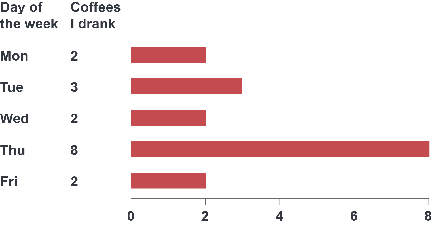
At a basic level, data visualization is just presenting data in a visual way, but when we plot data, we’re usually trying to make a point or tell a story with images. Even this simple graph tells a story: something happened on Thursday (or maybe Wednesday night).
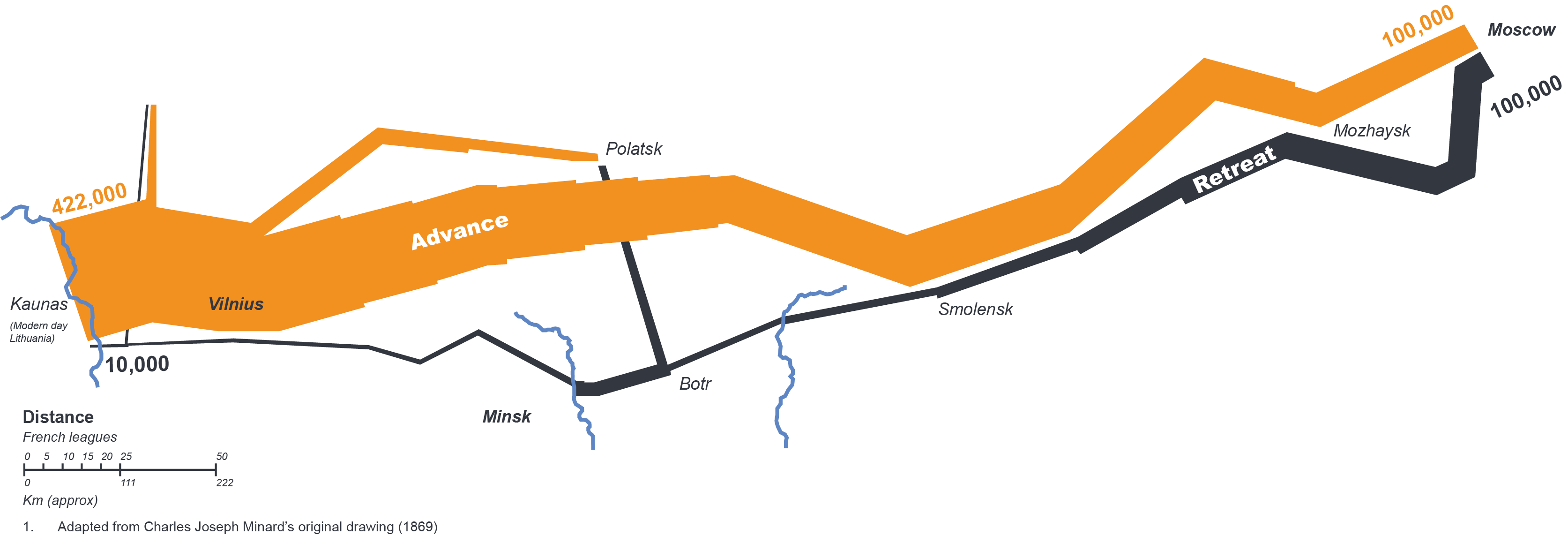
Data need stories to give them meaning – a human connection – and stories need data to give them substance. Without the context of the French advance and retreat through Russia’s brutal winter conditions, the following would just be data on the attrition of Napoleon’s forces in 1812–13. Likewise, without the data, the full tragic scale of this story would be lost.
Our brains are quick to process visual information, rapidly recognizing familiar objects or scenarios and spotting connections and patterns. This makes visual storytelling especially effective because images can tell fairly complex stories quickly, but this also means that we must avoid confusing the story with extraneous visual information.
Our approach
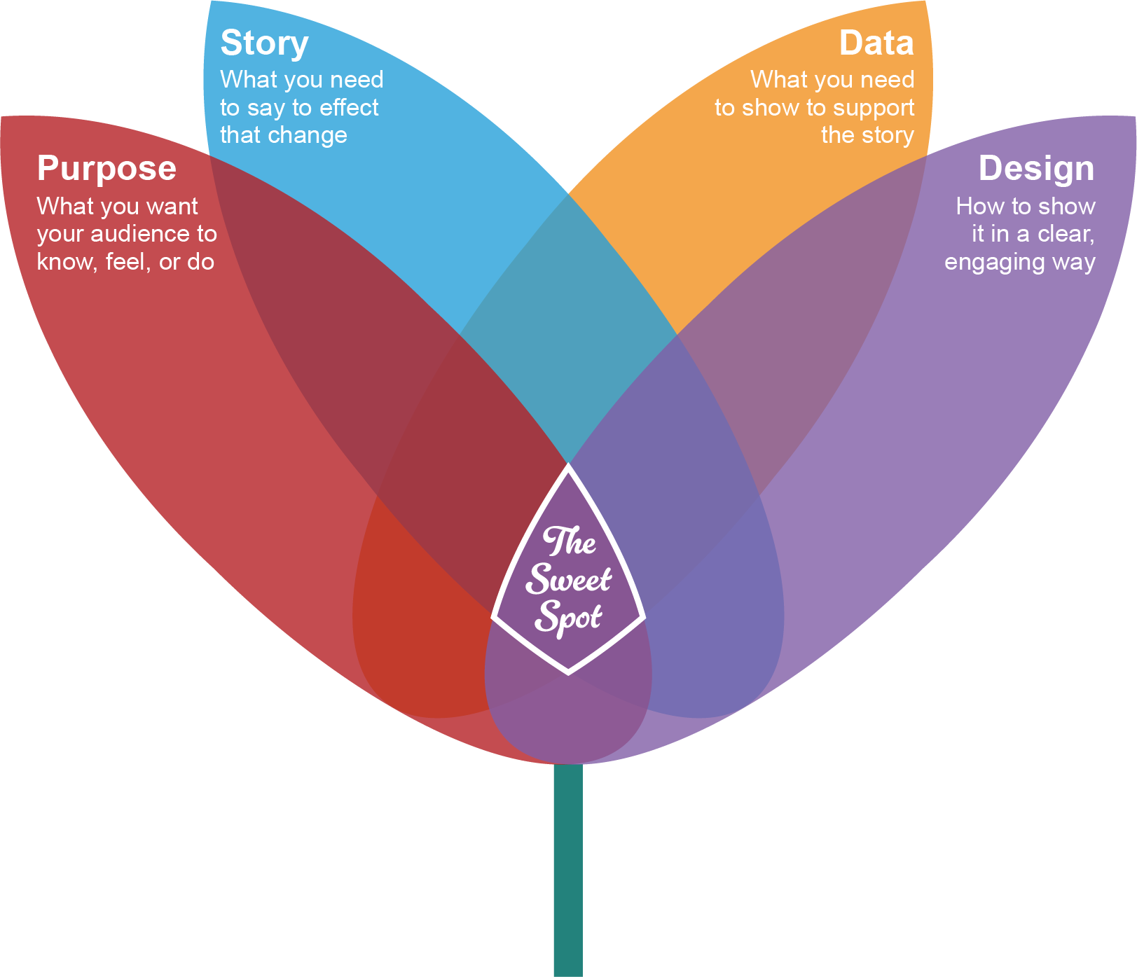
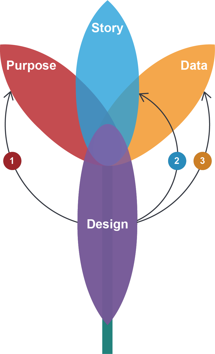
When telling a story with data visualization, there are four main aspects we consider: purpose, story, data, and design. By getting all four right, we hit the sweet spot: clear, compelling stories that catch the eye and empower change.
Firstly, we think about how the data can support the narrative and drive towards the purpose. Some data transformation, secondary analyses, or even additional data might be needed to best support the story.
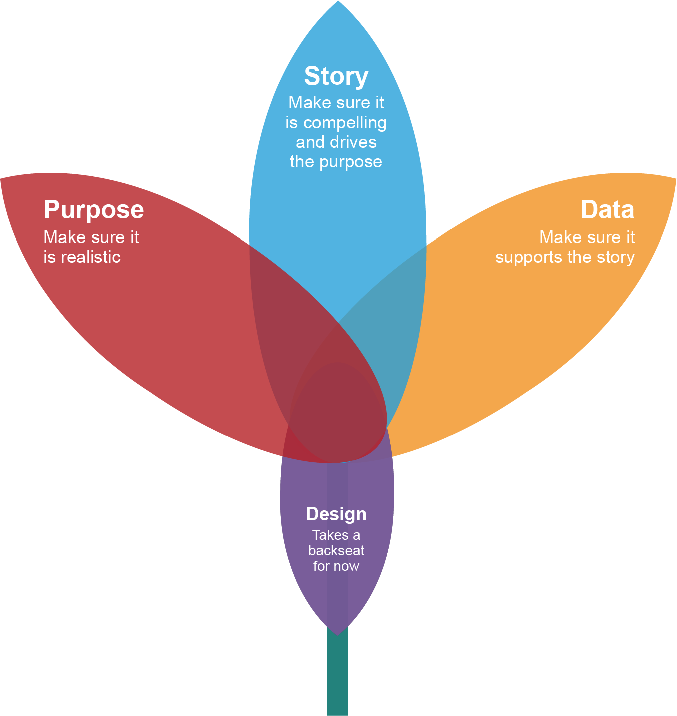
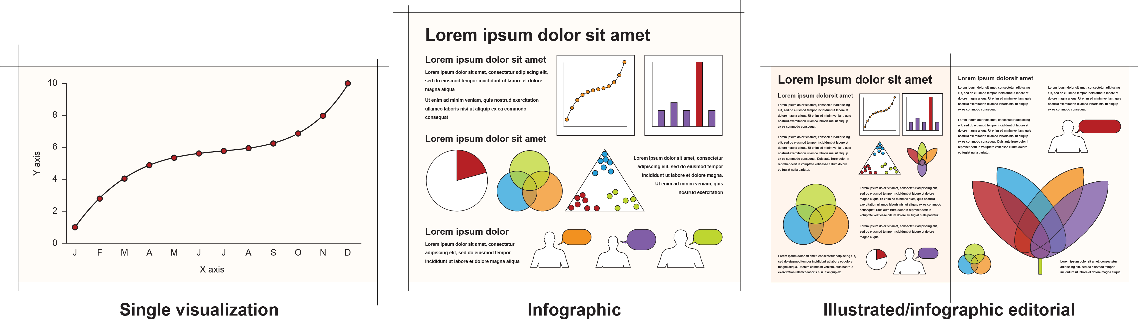
The desired effect on the audience often dictates the complexity of the story and the data needed to support it. Very short stories may best be communicated by a single or a few simple visualizations of a single dataset.
Several sets of data and some text may be needed to tell a longer, more complex story in an infographic format.
Finally, for long, complex stories, an illustrated editorial might be needed, comprising visualizations of multiple datasets and more detailed text.
Once we have the story and data working together, we think about design. Good design is about: 1) empowering the desired response by making it memorable and providing access to the necessary information; 2) creating visual elements that support the story and build a compelling narrative; and 3) reducing the cognitive load (the amount of work the viewer’s brain has to do) by finding the clearest way of showing the data without misrepresenting them.
As you can see, good data visualization isn’t about showing data in an unusual way, making a graph look pretty, or adding unnecessary graphics for visual interest. It’s about showing the data as clearly as possible, reducing the cognitive load for the audience, and keeping them engaged long enough to hear your story.
Data visualization: translating complex data into emotive storytelling
About the author

Data visualization: translating complex data into emotive storytelling
Data visualization: translating complex data into emotive storytelling
Contact CTA
Start a conversation
Find out how our experts can address your healthcare communication challenges.
Newsletter Subscription
Subscribe to our newsletter for the latest insights
Data visualization: translating complex data into emotive storytelling
Loading posts...
No posts found.